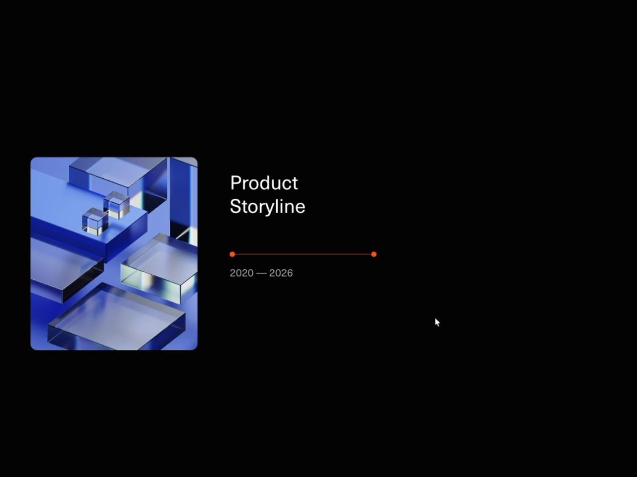
"use client";
import Timeline from "@/components/ui/timeline";
const settings = {
textColor: "var(--color-foreground, #ffffff)",
mutedTextColor: "var(--color-muted-foreground, #a1a1aa)",
activeColor: "#ff5f00",
backgroundColor: "var(--color-background, #0a0a0a)",
duration: 1.4,
};
export default function TimelineDemo(props: Partial<typeof settings>) {
const s = { ...settings, ...props };
return (
<main className="bg-background text-foreground">
{/* Lead-in so the pinned timeline has somewhere to scroll in from. */}
<section className="flex h-screen flex-col items-center justify-center gap-4 px-6 text-center">
<p className="font-mono text-xs uppercase tracking-[0.3em] text-muted-foreground">
Product roadmap
</p>
<h1 className="max-w-[18ch] text-4xl font-semibold leading-tight tracking-tight sm:text-6xl">
Six years, one horizontal scroll.
</h1>
<p className="max-w-md text-sm leading-relaxed text-muted-foreground">
Keep scrolling — the section pins, the track slides sideways, and each
milestone draws its stem and reveals its copy as it reaches centre.
</p>
<span className="mt-2 animate-bounce text-muted-foreground">↓</span>
</section>
{/* Realistic usage: custom copy, a branded accent, tuned reveal speed. */}
<Timeline
title="Product Storyline"
periodLabel="2020 — 2026"
backgroundColor={s.backgroundColor}
textColor={s.textColor}
mutedTextColor={s.mutedTextColor}
activeColor={s.activeColor}
imageUrl="https://cdn.21st.dev/assets/mirror/b0/b0c41784074f76ac5fb6b447da87780c901135841317a096241371f24bc13ddd.jpg"
imageAlt="Team at work in a bright studio"
duration={s.duration}
/>
<section className="flex h-screen items-center justify-center px-6 text-center text-sm text-muted-foreground">
From the first research note to a multi-market launch.
</section>
</main>
);
}