"use client";

import * as React from "react";
import { GooeyNavigationMenu } from "@/components/ui/gooey-navigation-menu";
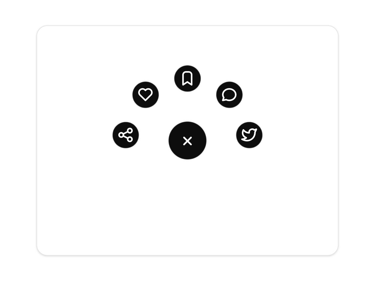
import { IconBookmark, IconShare, IconHeart, IconMessageCircle, IconBrandTwitter } from "@tabler/icons-react";

const GOOEY_ITEMS = [
  { id: "share", label: "Share", icon: <IconShare stroke={2.2} /> },
  { id: "like", label: "Like", icon: <IconHeart stroke={2.2} /> },
  { id: "bookmark", label: "Save", icon: <IconBookmark stroke={2.2} /> },
  { id: "message", label: "Reply", icon: <IconMessageCircle stroke={2.2} /> },
  { id: "tweet", label: "Tweet", icon: <IconBrandTwitter stroke={2.2} /> },
];

const settings = {
  direction: "up",
  itemCount: 5,
  arc: 170,
  radius: 92,
  size: 60,
  childSize: 44,
  defaultOpen: true,
};

/* The stage is a fixed square centred in the preview, large enough to
 * contain the arc in any direction without ever shifting the trigger. */
function stageSize(radius: number, childSize: number) {
  return (radius + childSize / 2 + 16) * 2;
}

/* ───────────────────────── Preview ───────────────────────── */

export function GooeyNavigationMenuPreview(props: Partial<typeof settings> = {}) {
  const state = { ...settings, ...props };
  const items = React.useMemo(
    () => GOOEY_ITEMS.slice(0, Math.max(2, Math.min(state.itemCount, GOOEY_ITEMS.length))),
    [state.itemCount],
  );
  const size = stageSize(state.radius, state.childSize);

  return (
    <div className="grid min-h-[420px] w-full place-items-center p-6">
      <div className="grid w-full max-w-md place-items-center rounded-2xl border border-[var(--border)] bg-[var(--card)] py-10 shadow-sm">
        <div style={{ width: size, height: size, display: "grid", placeItems: "center" }}>
          <GooeyNavigationMenu
            key={`${state.direction}-${state.itemCount}-${state.defaultOpen}`}
            items={items}
            radius={state.radius}
            arc={state.arc}
            direction={state.direction}
            size={state.size}
            childSize={state.childSize}
            defaultOpen={state.defaultOpen}
          />
        </div>
      </div>
    </div>
  );
}

export default function Demo(props: Partial<typeof settings>) {
  return <GooeyNavigationMenuPreview {...props} />;
}